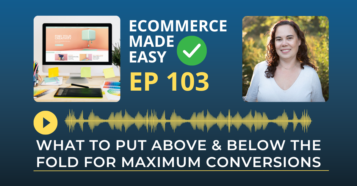
Did you know that the layout of your homepage can make or break your website’s success? 🧐
If visitors land on your site and don’t instantly find what they’re looking for, they’ll bounce faster than you can say “conversion rate.” Today, we’re diving into the Homepage Formula—what you need to put above and below the fold to maximize your conversions and keep visitors engaged from the get-go.
Let’s Recap: What to Put Above & Below the Fold for Maximum Conversions
Why Your Website Might Be Invisible
Why Your Homepage Matters
- Your homepage is often the first impression visitors get—make it count!
- Studies show that visitors form an opinion about your site within 50 milliseconds.
- If your homepage is cluttered or unclear, they’re likely to leave.
- Your goal: Guide visitors, build trust, and drive them to take action.
What to Put Above the Fold
The “above the fold” area is what users see without scrolling. It’s prime real estate, so make it count.
Key Elements to Include:
- Clear, Compelling Headline:
- Your headline should immediately communicate your value.
- Example: “Transform Your Business with High-Converting Websites”
- Avoid vague or overly clever headlines that don’t clearly state what you do.
- Subheadline or Brief Description:
- Support the headline with a succinct explanation.
- Example: “Helping coaches and course creators build websites that work 24/7.”
- A Strong Call to Action (CTA):
- Guide your visitors on what to do next—Book a Call, Download a Free Guide, etc.
- Keep it short, action-oriented, and visually distinct (like a bold button).
- Visual Element:
- Use a high-quality image or video that supports your message.
- People connect with faces—show a welcoming team photo or a short intro video.
- Navigation:
- Keep it clean and simple—limit top-level menu items to 4-6.
- Use clear, descriptive labels like “About,” “Services,” “Blog,” and “Contact.”
Pro Tip: Check how your homepage looks on both desktop and mobile—what’s visible on one may not be on the other.
What to Put Below the Fold
Once visitors are intrigued, they’ll scroll down for more. This area should build on the value you presented above the fold.
Key Elements to Include:
- Social Proof:
- Testimonials, reviews, client logos, or media mentions.
- People want to know they can trust you—show them proof.
- Features and Benefits:
- Go into detail about what makes your offer unique.
- Use bullet points or icons to make it scannable.
- Supporting Content:
- A brief section about your services or products with links to learn more.
- Keep it focused and easy to navigate.
- Visual Breaks:
- Use alternating background colors or images to keep the content visually interesting.
- Additional CTAs:
- Reiterate your main call to action or offer a secondary option.
- Example: “Get Started” or “Learn More”
Pro Tip: Don’t overload below the fold. Prioritize your most important information and calls to action.
Rate, Review, & Follow on Apple Podcasts
If you’re loving my eCommerce Made Easy Podcast, I’d be thrilled if you could rate and review the show on Apple Podcasts. Your ratings and reviews help me reach more listeners and empower more people like you to thrive in the online business world.
Just click here to head over to Apple Podcasts, scroll down, give us a five-star rating, and share what you enjoyed most about the episode in the “Write a Review” section.
If you haven’t hit that follow button yet, now’s the perfect time! I have new episodes coming your way every week that you won’t want to miss. Hit the follow button and stay up to date with the eCommerce Made Easy Podcast! Follow Now!
